What makes an interesting enemy?
Great enemy design helps the hero stand out by focusing on “opposites”. The contrast between the Hero and the Enemy creates a strong visual relationship. The contrast between the Scouts and Titans exemplifies a great rivalry. Small vs Big, Fast vs Slow, Human vs Monster.
Great enemies make the player anticipate the battle. When they look at the enemy, they can imagine what they are capable of, and defeating the enemy makes the player feel good.
Great enemies have a strong and consistent design language.
Example: The TITANS (from Attack on Titan) are a visually cohesive enemy group. No skin, exposed muscles, and unbelievable size are their common traits that provide a signature look.
Enemy Design Pillars
• Inverse of the Hero and their characteristics
• A clear relationship between attacks/abilities and how they look
• Consistent design element to indicate a shared origin

If the hero is small the enemy is big, if the hero is fast then the enemy is slow. By creating contrasting styles it allows the player to quickly understand the relationship between the heroes and enemies.
Example: In PIXAR’s SOUL the “new” soul is bright, small, has expressive eyes, has soft edges and texture, and floats. But the “lost” soul is dark, very large, has a blank stare, has a hard and rough texture, doesn’t t float, and is missing their core (incomplete).

Visually you should be able to see the opposite relationship between these two states of the characters.
Relationship between LOOK and ABILITY
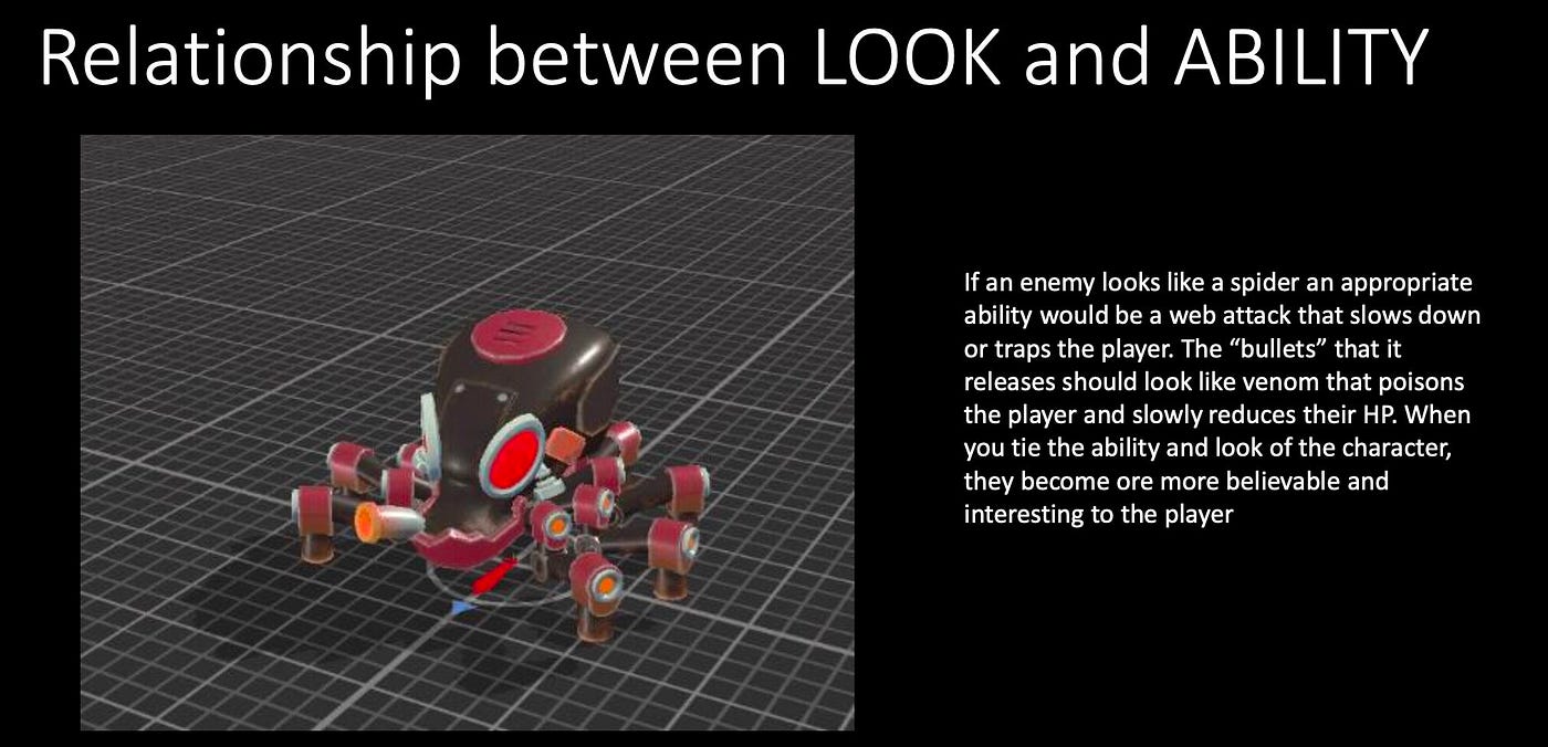
If an enemy looks like a spider an appropriate ability would be a web attack that slows down or traps the player. The “bullets” it releases should look like venom that poisons the player and slowly reduces their HP.
When you tie the ability and look of the character, they become more believable and interesting to the player.

Status Effects and Elements are also a great way to make enemy abilities more visual. You can take one character design and by changing its color (Purple = POISON, Blue = WATER, Red = FIRE, etc.), its effects change as well.
Consistent Design Elements
Enemies should not only look like they belong in the environment (unless they are invading enemies), but they should also look like they are part of a team, and teams (just like in sports) have some shared design elements (with some minor exceptions).
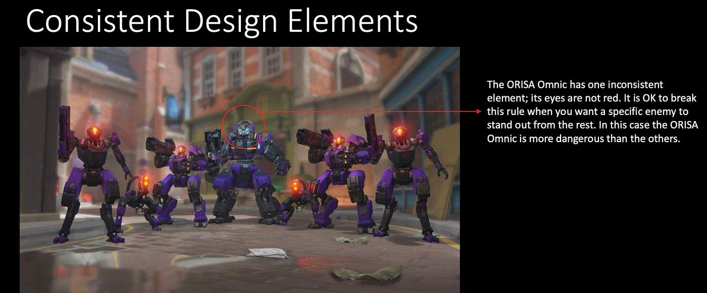
In the UPRISING events for Overwatch the Omnics come in various shapes and sizes, but they all share a few key elements; a purple color (all) scheme and red eyes (most).

Consistency does not mean having no variation. The “Tailed Beasts” In Naruto (for example) are all different but their design consistency is their tails from 1 tail to 9 tails. Even though each beast is unique the audience understands that they are all related and know which is more powerful.
Think of these things when you are designing the enemies for your game.
**Follow me on LinkedIn https://www.linkedin.com/in/kellybender17/ for more Narrative Design tips, resources, and insights.**